Our eyes tend to take a lot of shortcuts. This is why, for example, in the Müller-Lyer illusion below, the upper horizontal bar looks longer than the lower one (they’re actually the same length). These kinds of illusions can be thought of as “adversarial examples” for our visual system. They exploit the shortcuts we take to measure distances, perceive depth or infer colors (among others), often revealing something about how our vision works.

What would an adversarial example look like for a data visualization? Could there be configurations of bars in a bar chart that could distort our perception of the mean or range?

If we could find such examples, they could show us what kinds of shortcuts we take when reading charts. In the field of Data Visualization, we call these shortcuts “perceptual proxies,” and there is a lot of interest in figuring out which ones we use. Aside from learning more about what makes charts so powerful, this knowledge could also lead to chart designs that are more effective and more robust to misleading edge cases.
Creating adversarial examples
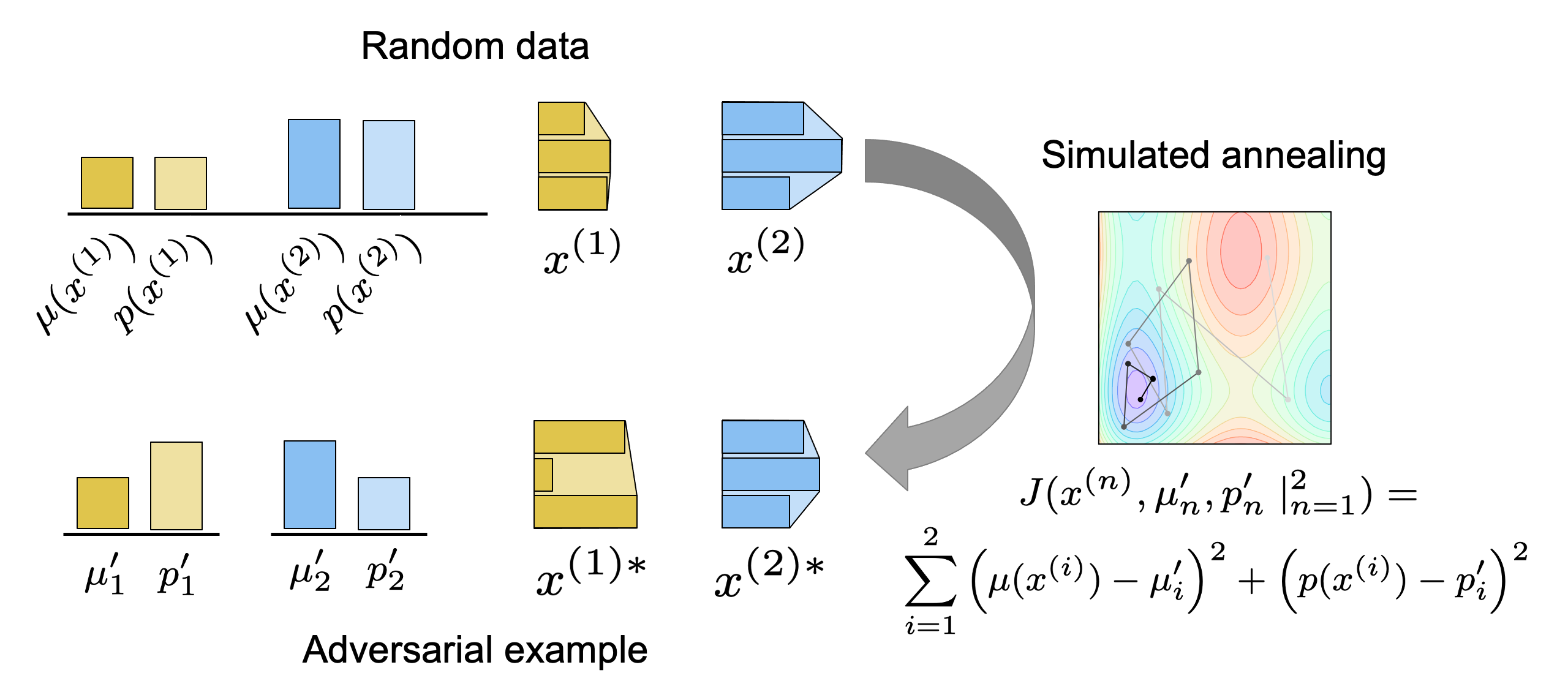
How do we find such adversarial examples for visualizations? In our first approach, we start with a list of educated guesses for what proxies our visual system might use, and use those to try to create them. Below is an example for convex-hull-area as a proxy for the mean of a bar chart. This is like the area filling a rubber band wrapped around the bars. We use simulated annealing to create pairs of charts where the chart with the larger mean has a smaller convex-hull-area.
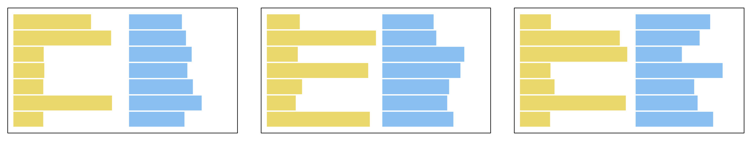
Now we can ask people which one has the larger mean and see if they get it wrong, potentially catching the visual system in the act of taking its shortcut. In our experiments the most adversarial charts were based on a “centroid” proxy, like the charts below. The bars in the yellow charts below have centroids further to the right than the blue ones, though the blue charts have higher means.
Human-guided optimization
In those experiments, we had to guess at proxies that people might be using. But what if we could just let the visual system show us what an adversarial chart looks like? We can do this by treating how big a chart’s mean appears as a black-box function that we are optimizing. There are many methods to optimize unknown functions, but here we use Dueling Bandit Gradient Descent, which has the added benefit of needing only ranked comparisons.
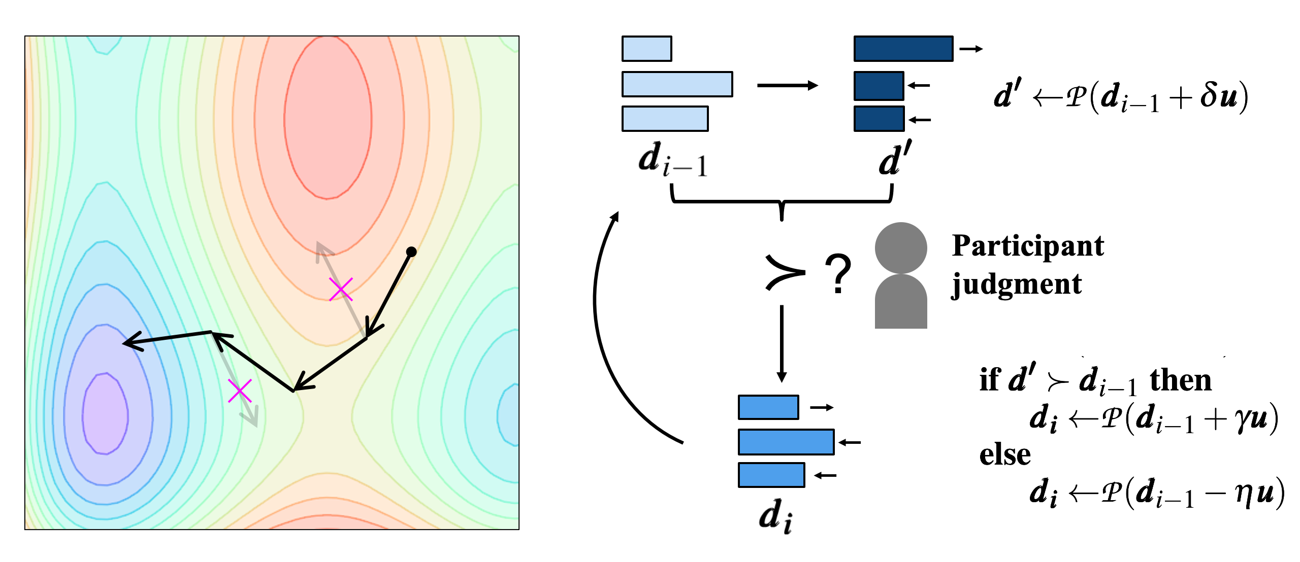
The algorithm begins with an exploration phase, in which we take a random step from the previous iteration (with the first iteration initialized randomly) and project to the constraint space, which in this case returns the mean to the same value.
Next we need to rank the previous point against this new point with our “function,” which, remember, is how large the mean appears to the human visual system. Since both charts actually have the same mean, we get this ranking by inserting the pair into a list of other pairs that do have different means. We show all of these pairs to participants, asking them to pick the chart with the larger mean for each, and leaving them (hopefully) none the wiser to the misdirection.
For the final, exploitation phase, we take a step towards the exploratory point if and only if it was ranked higher, letting us ascend the hypothetical gradient of our function (if the new point was not ranked higher, we can do nothing, although in our implementation, we actually take a small step in the opposite direction). The algorithm then repeats for a number of iterations or until convergence.
Below are some (cherry-picked) results. These are charts that started as random data and were optimized (in theory, at least) purely by human judgment.
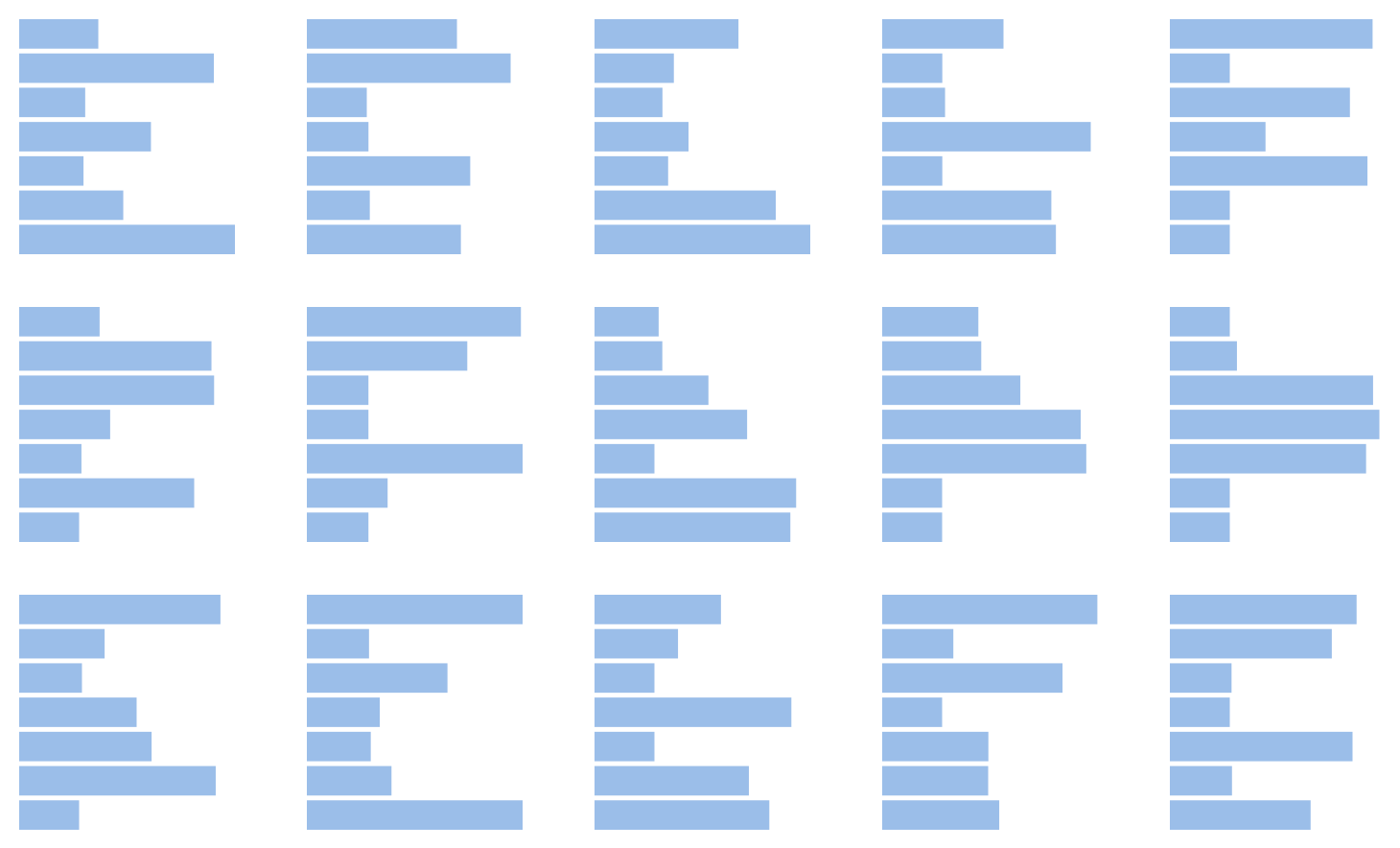
Many of them look a lot like the adversarial charts with high centroid proxies from the previous experiment: mixtures of very short and very long bars. Although more investigation of the results of both experiments is needed, they provide elegantly complementary evidence that the centroid proxy is at least on the right track.
Face to Face: Evaluating Visual Comparison
Brian Ondov, Nicole Jardine, Niklas Elmqvist, Steven Franconeri
pdf • doi
The Perceptual Proxies of Visual Comparison [Hon. Mention for Best Paper]
Nicole Jardine, Brian Ondov, Niklas Elmqvist, Steven Franconeri
pdf • doi